Brand Identity Project: On & On Podcast
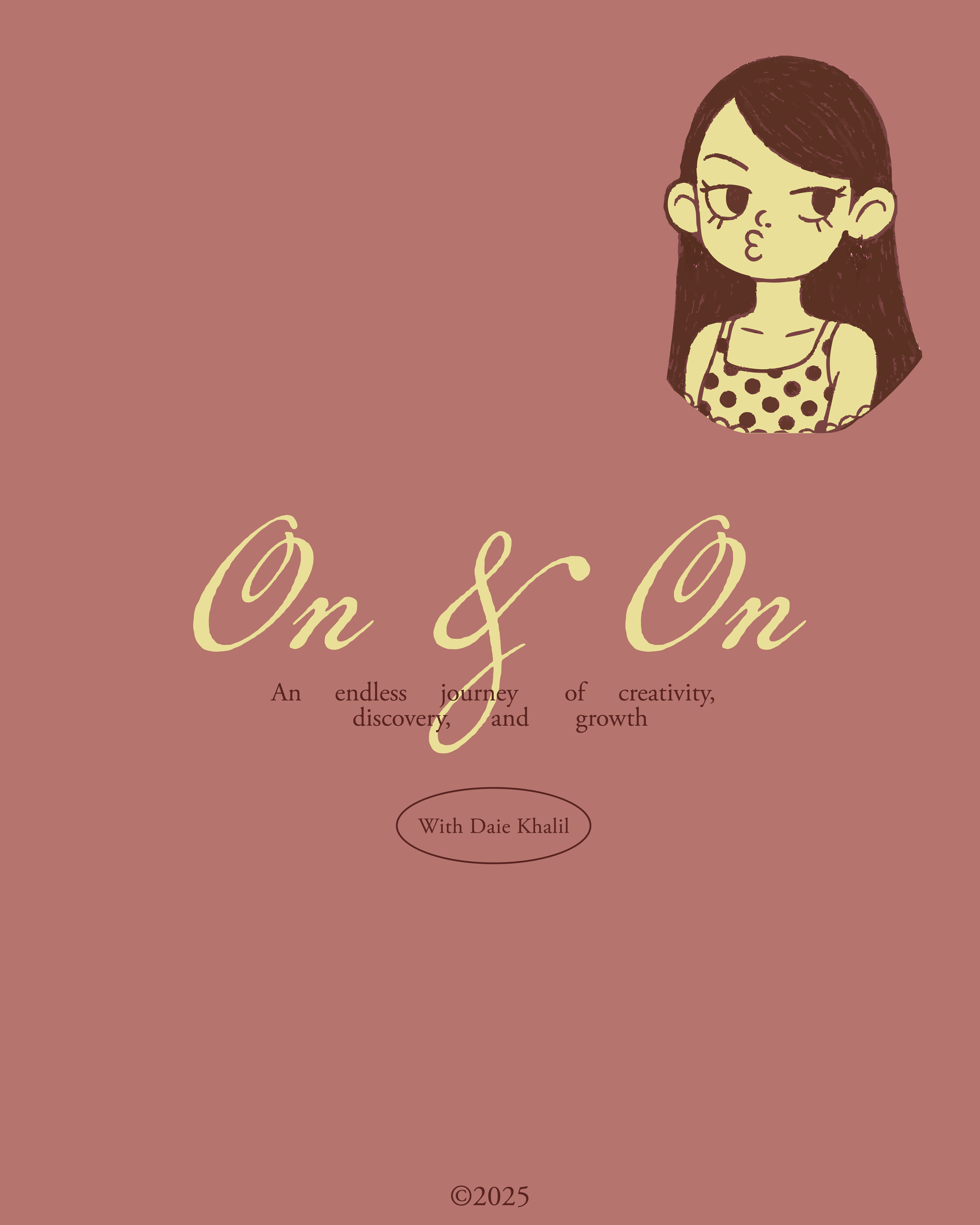
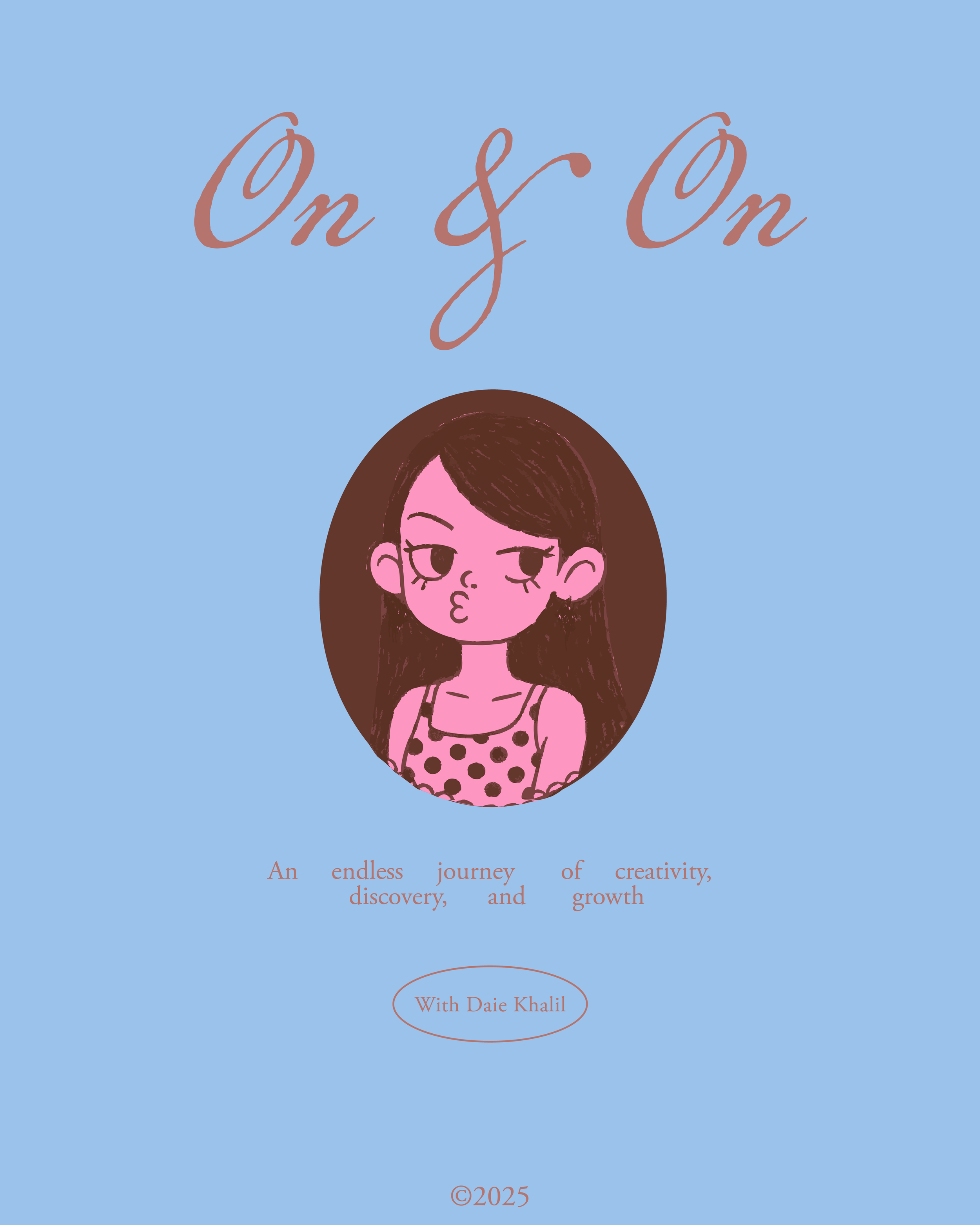
On & On was designed as a podcast identity that embraces continuity, reflection, and emotional honesty. The flowing script logo reinforces the idea of thoughts that don’t stop, while the supporting serif typography grounds the brand with structure and clarity. Together, they create a visual language that feels personal yet intentional, expressive but composed.
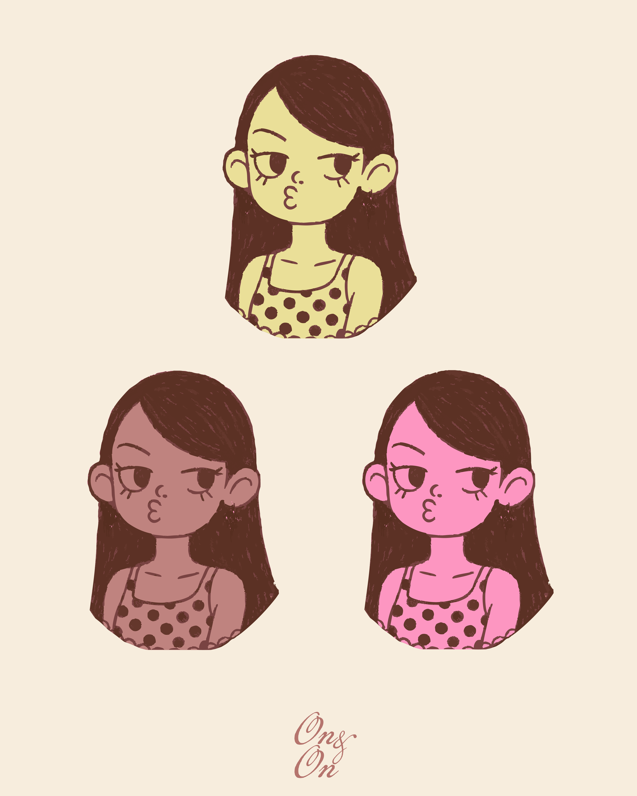
The character illustration acts as the emotional anchor of the identity, adding a human touch to the identity. Paired with a soft, nostalgic color palette, the brand feels warm, intimate, and lived-in. Every element works together to support the core idea of the podcast: conversations that unfold naturally, ideas that evolve over time, and creativity that grows quietly, on & on.
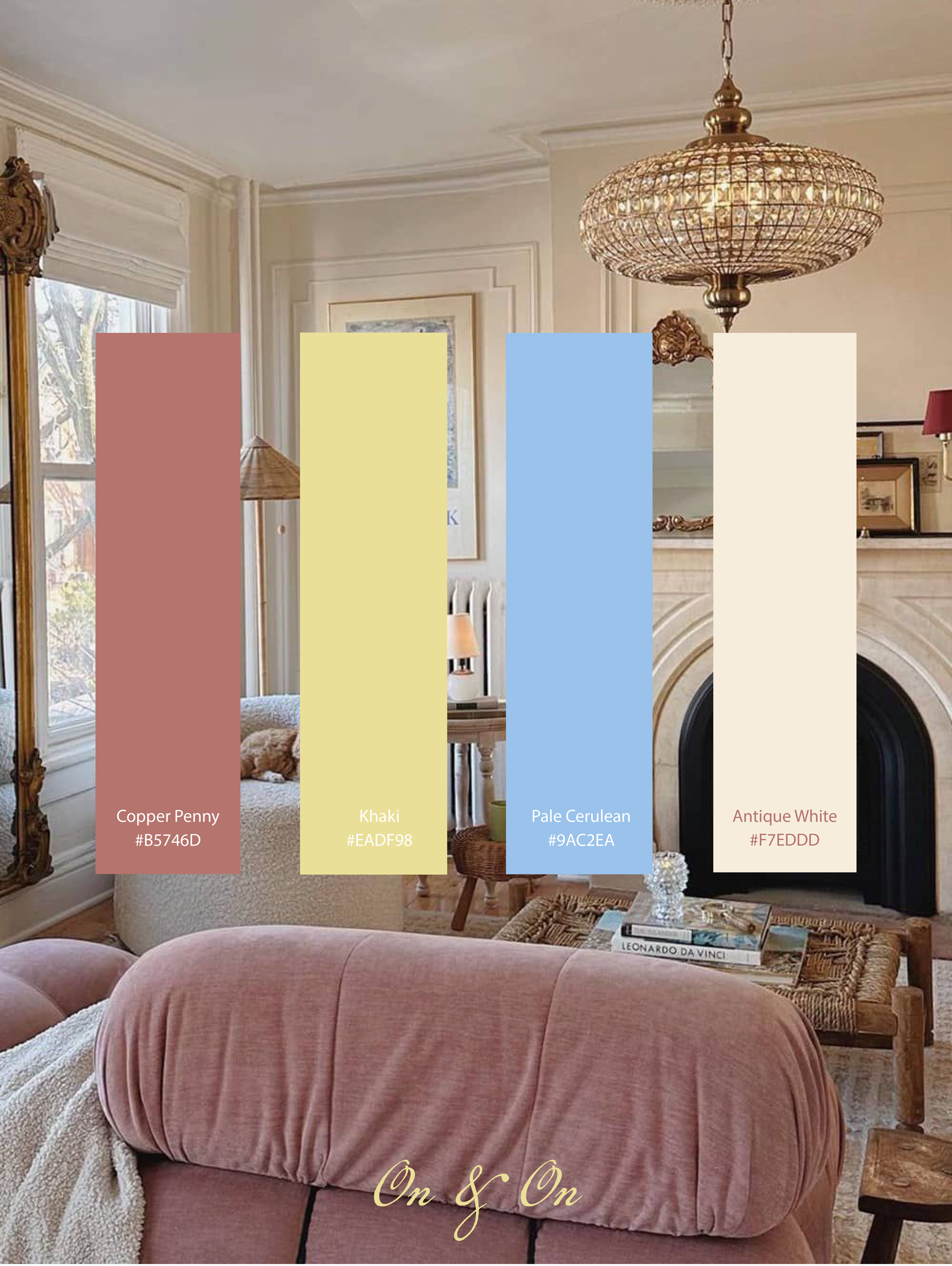
The color palette feels soft, nostalgic, and emotionally grounded, built on muted, low-saturation tones that work in quiet harmony. The copper penny brings warmth and depth, the khaki adds a sun-washed lightness, the pale cerulean introduces a calm, reflective contrast, and the antique white creates space and balance. Together, they avoid anything overly vibrant or polished, instead creating a lived-in, intimate atmosphere that supports the mood of the podcast rather than overpowering it.
On a more subtle level, the identity leans heavily on rhythm and pacing rather than just visual aesthetics. The spacing between elements, the restrained use of type, and the deliberate breathing room throughout the layouts mirror the cadence of a thoughtful conversation, never rushed, never overcrowded. The script mark isn’t just expressive; its scale and placement shift across applications to create moments of emphasis, almost like pauses or highlights within dialogue. Meanwhile, the serif typography is treated with a quiet discipline, often understated, allowing the content itself to feel like the hero rather than the design overpowering it.