Brand Identity Project: Haven
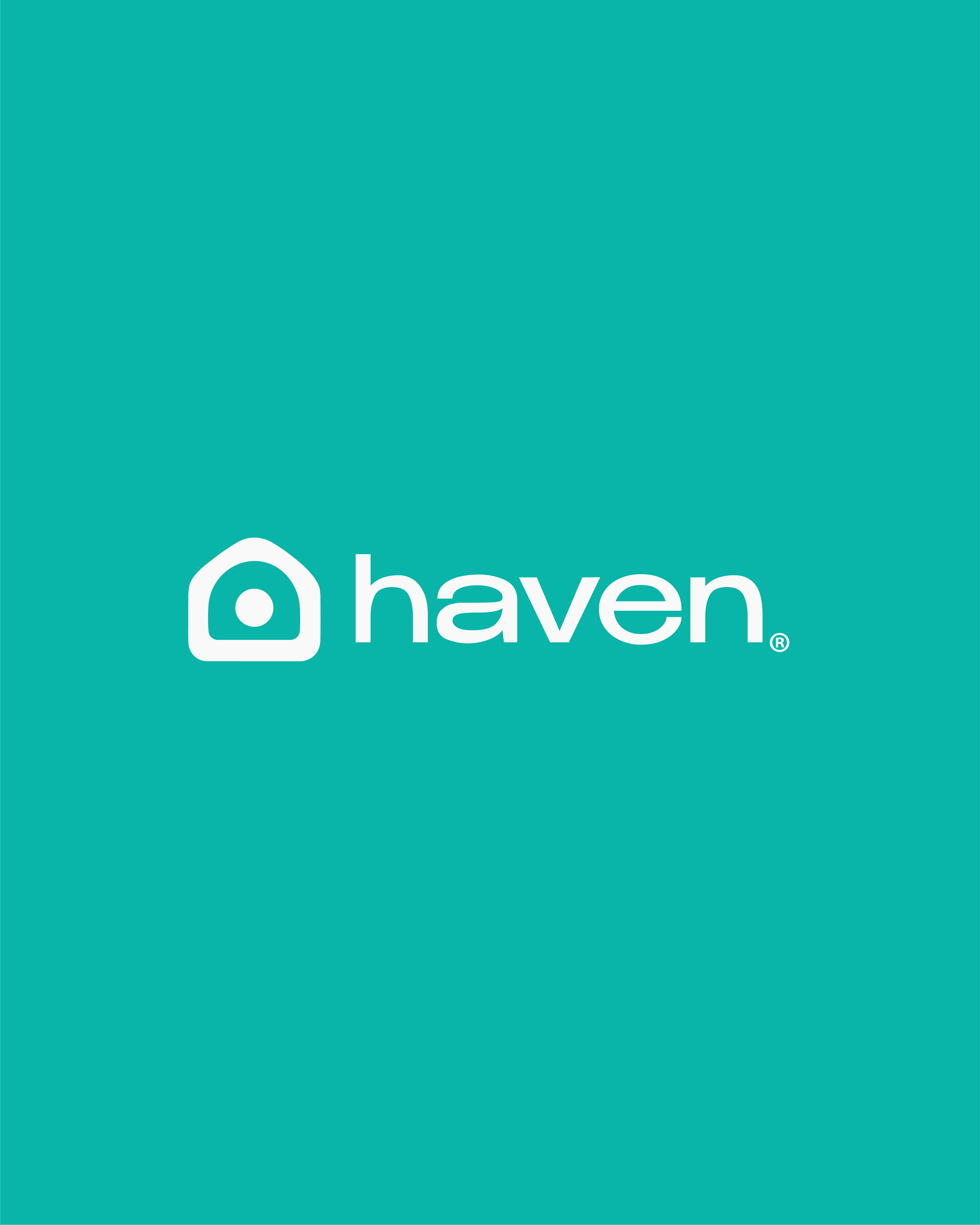
Haven was designed as an energy access system for mobile devices, built around continuity, ease, and trust. The symbol draws from the idea of a safe place, reinterpreted into a minimal mark that feels both human and technological.
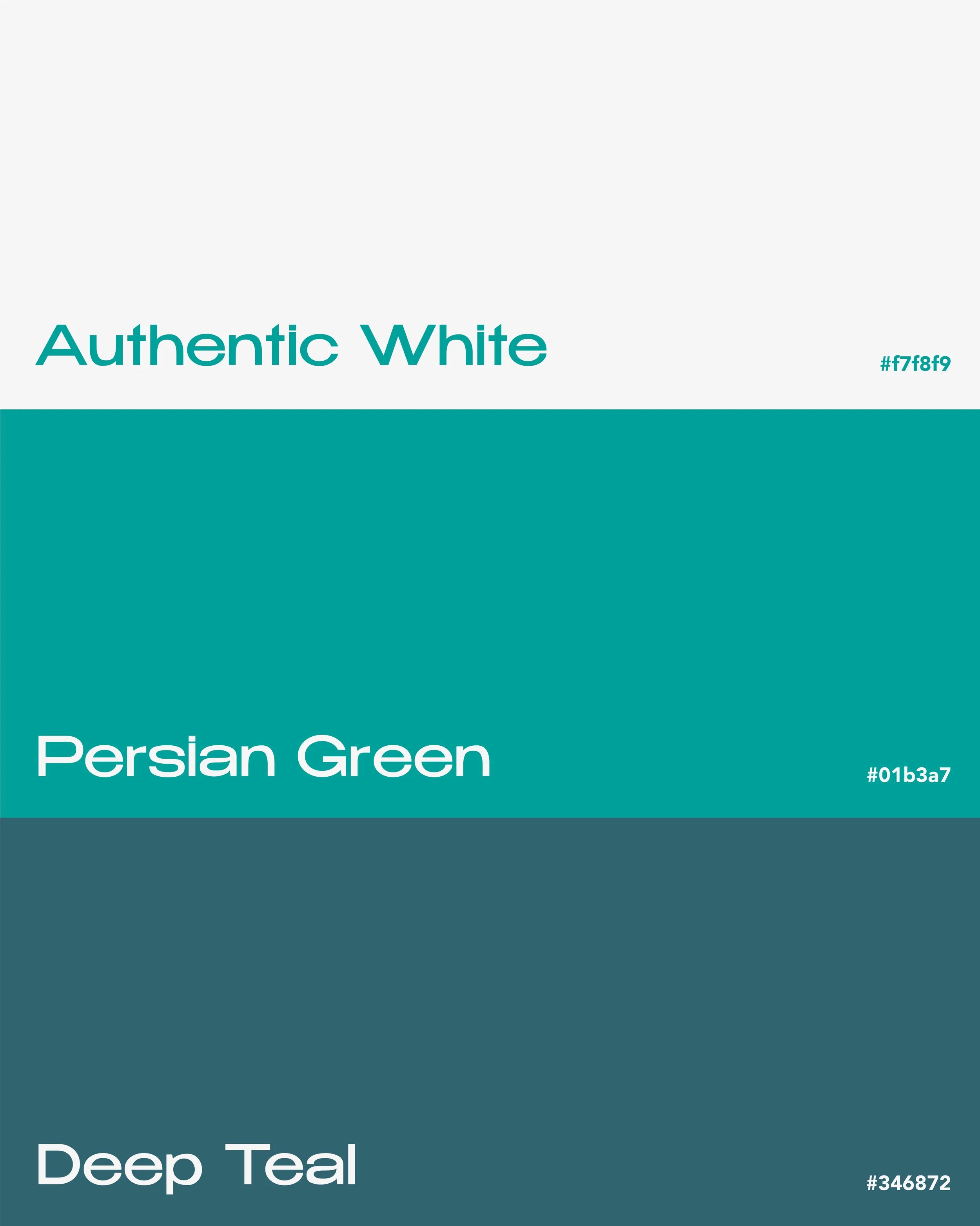
Paired with clean typography, the visual language communicates clarity and function with restraint. A refined palette of green tones gives the brand a sense of calm energy, fresh, grounded, and distinct from the harsher visual language often seen in tech.
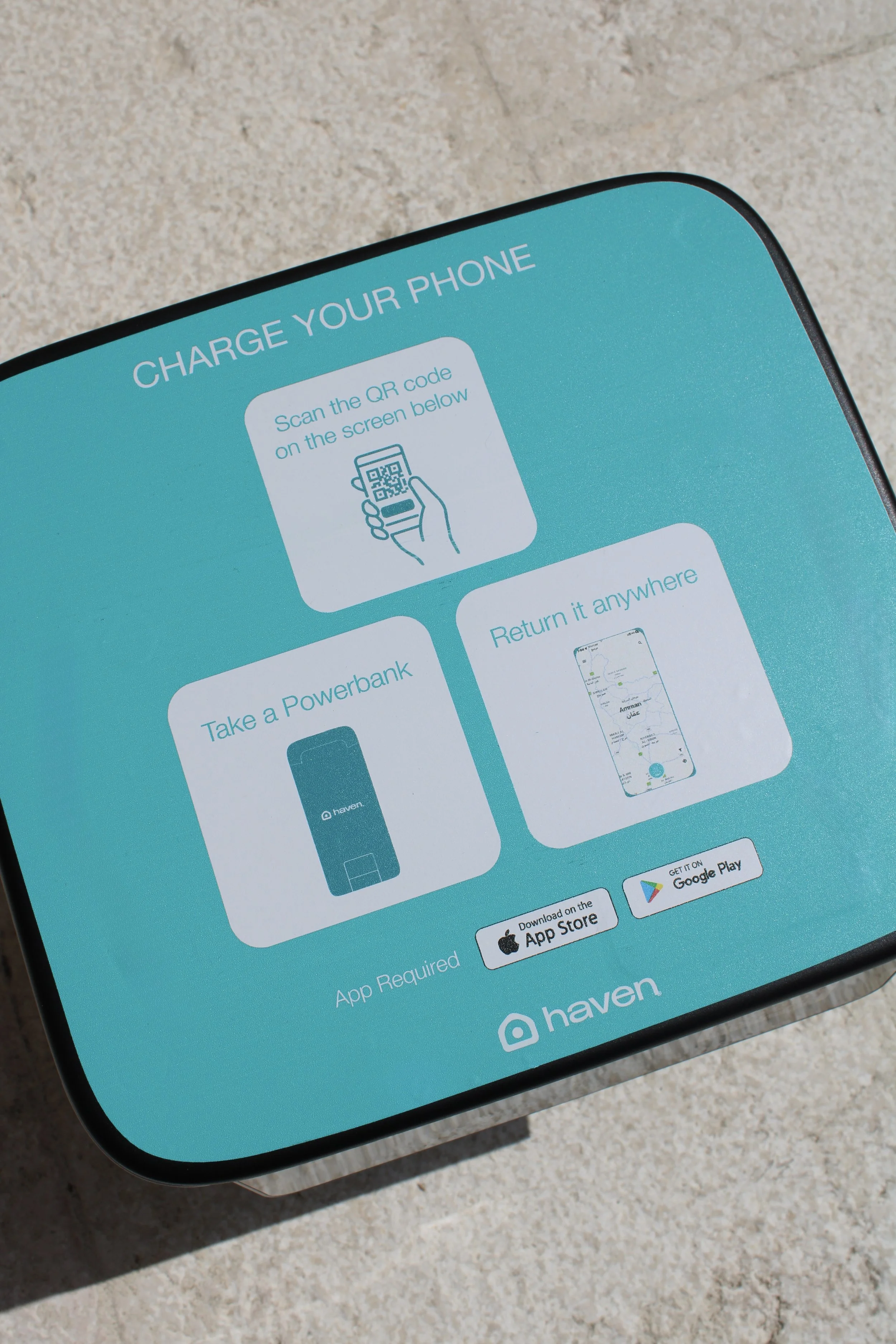
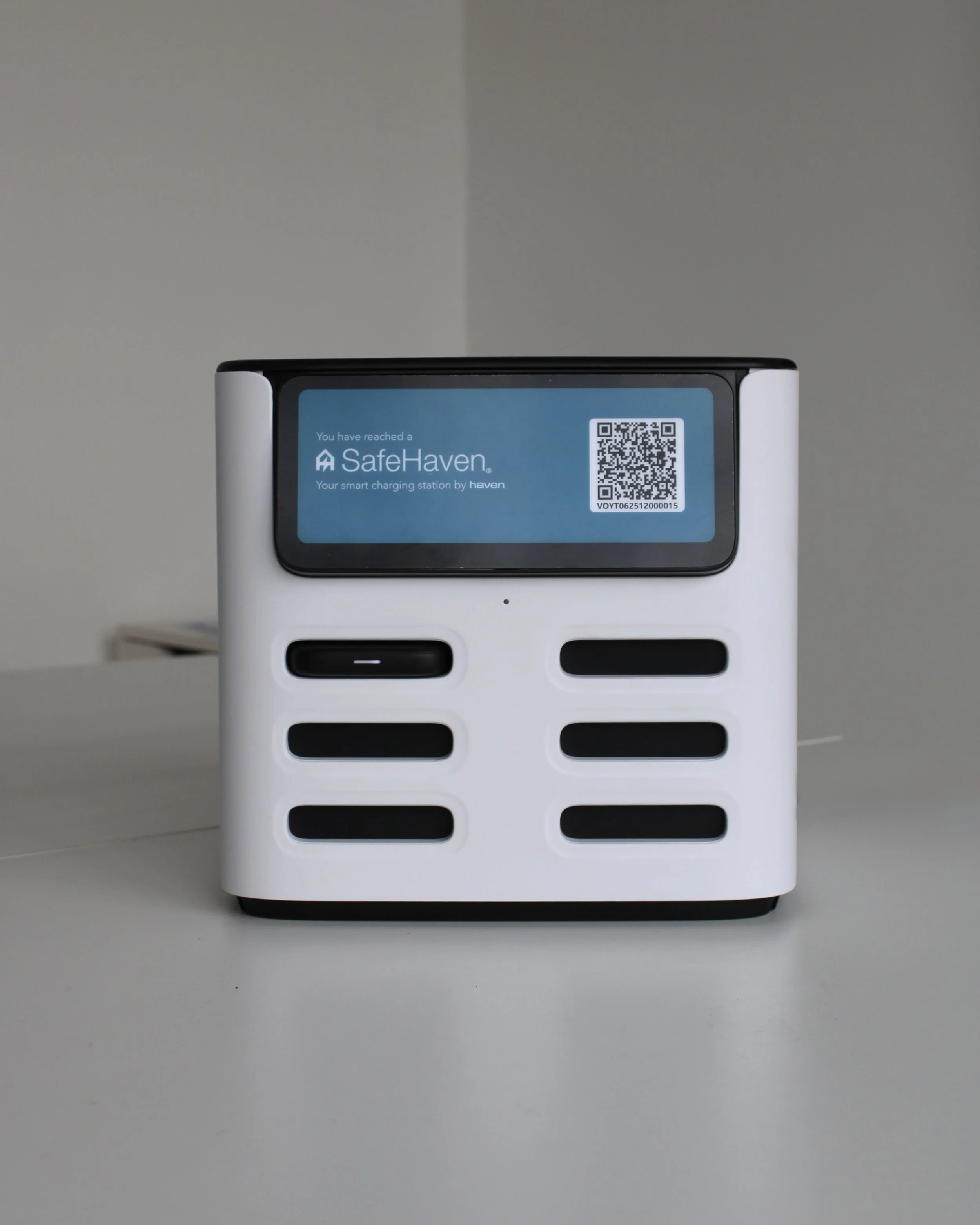
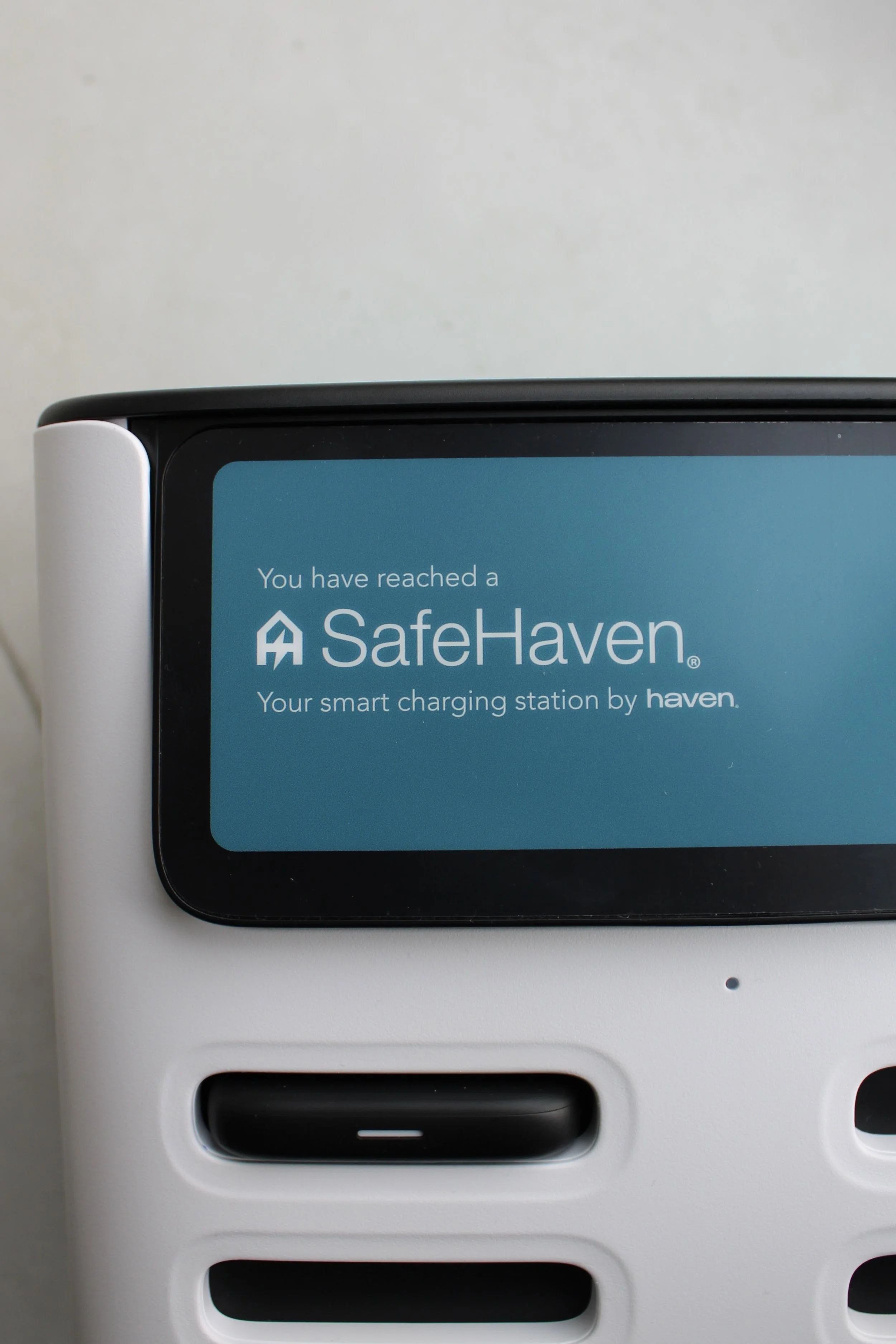
The system also extends into SafeHaven®, a sub-brand created for the physical charging stations themselves, becoming the place you arrive at, the direct touchpoint between the brand and the user.
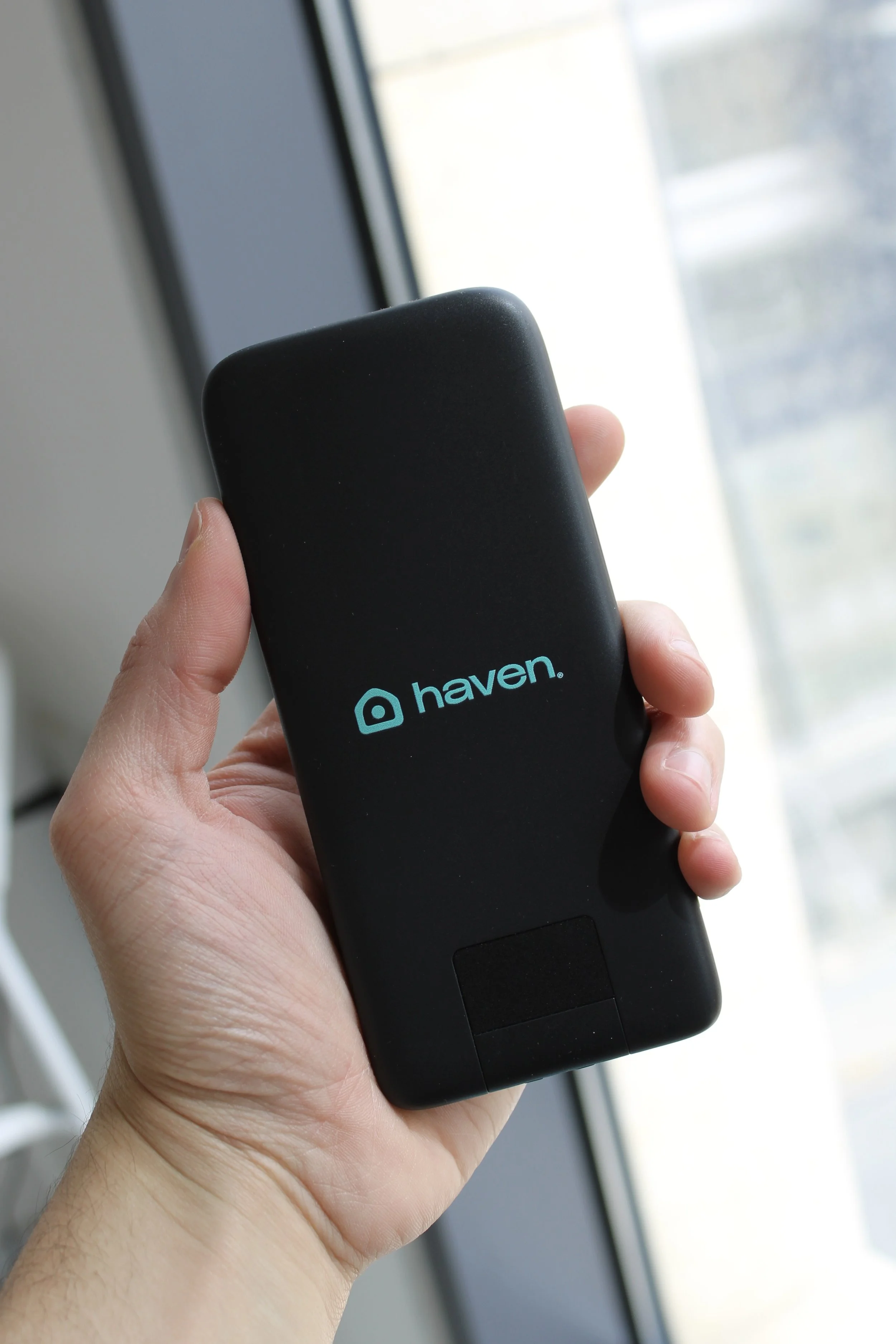
From portable power to physical stations, every element was designed to feel integrated into everyday life, with power that meets you where you are.