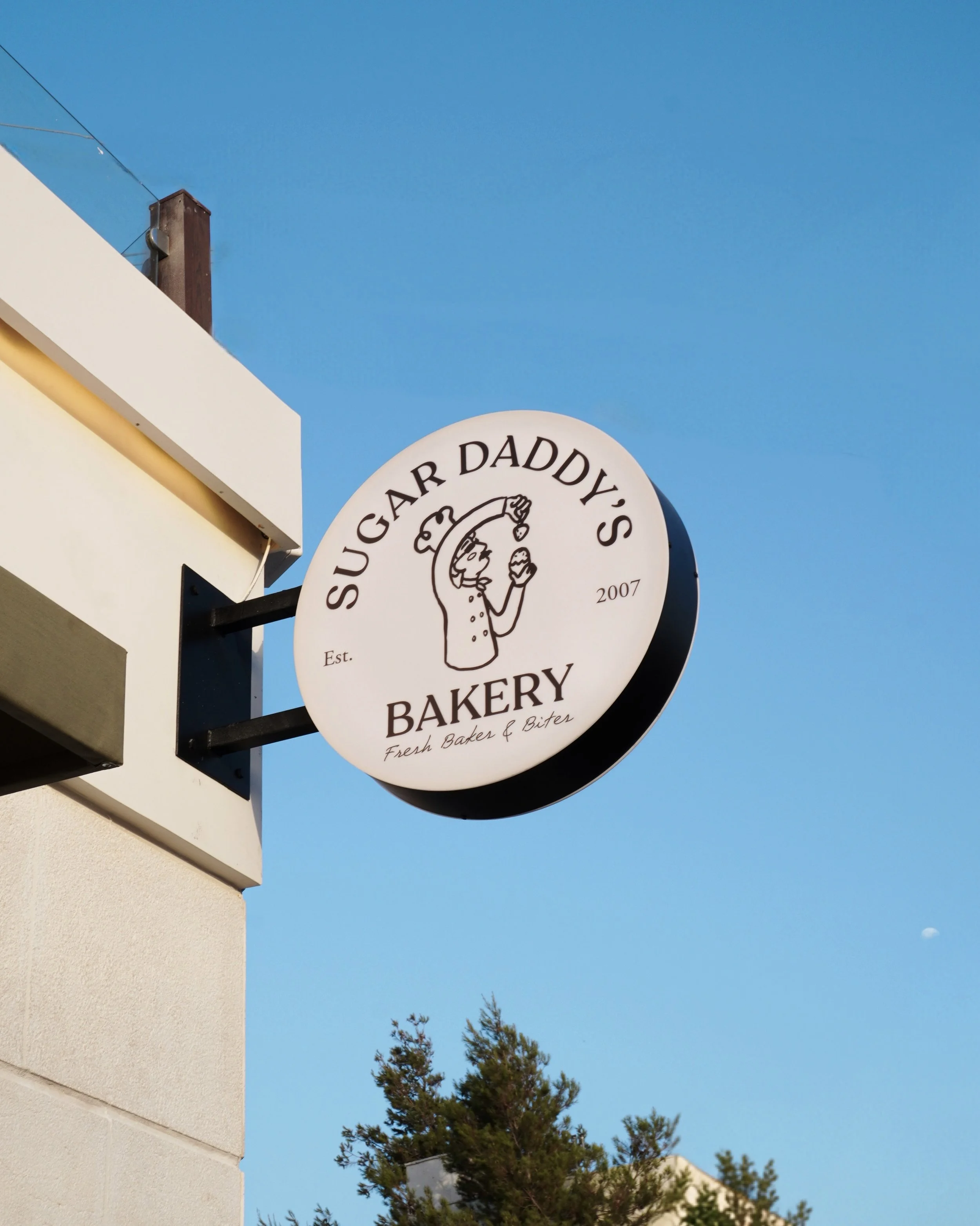
After 20 years of being known for its bold pink storefront and familiar neighbourhood presence, Sugar Daddy’s Bakery was ready for a new chapter, one that felt calmer, warmer, and closer to the bakery it had grown into. The rebrand moves away from the loudness of the past without losing its personality, shaping a more refined, artisanal world that reflects the bakery’s evolution beyond sweets. The challenge was to introduce a fresh visual direction while preserving the familiarity, character, and sense of nostalgia that had made Sugar Daddy’s a recognisable part of its community.
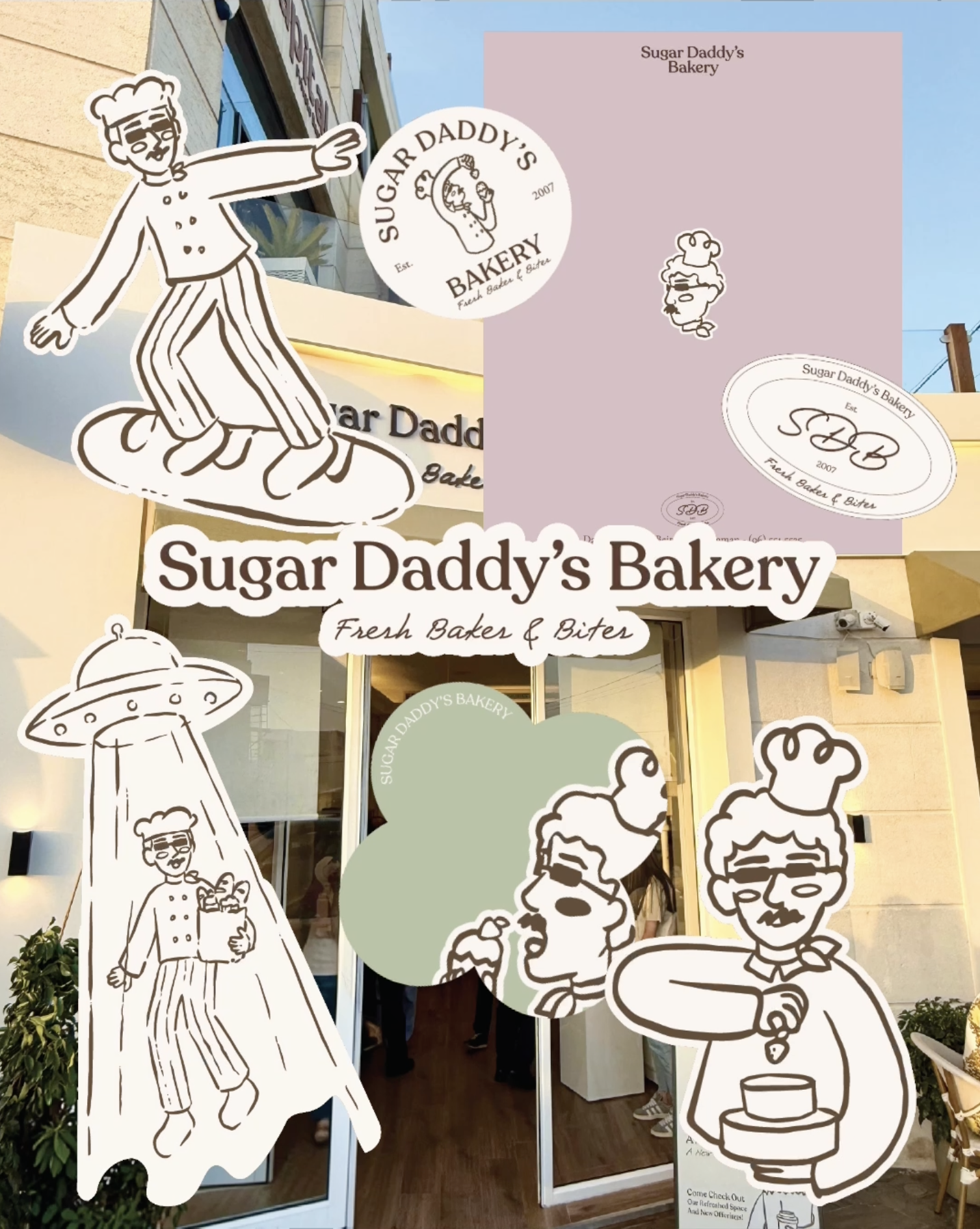
A soft palette of cream, chocolate brown, sage, dusty pink, butter yellow, and pale blue sets the tone, replacing the previous intensity with a warmer and more considered visual language. Expressive typography introduces a balance of character and refinement, while a hand-drawn illustration system brings personality into every detail. Together, these elements create a flexible identity that feels nostalgic without looking dated, playful without becoming childish, and polished without losing the warmth at the heart of the bakery.
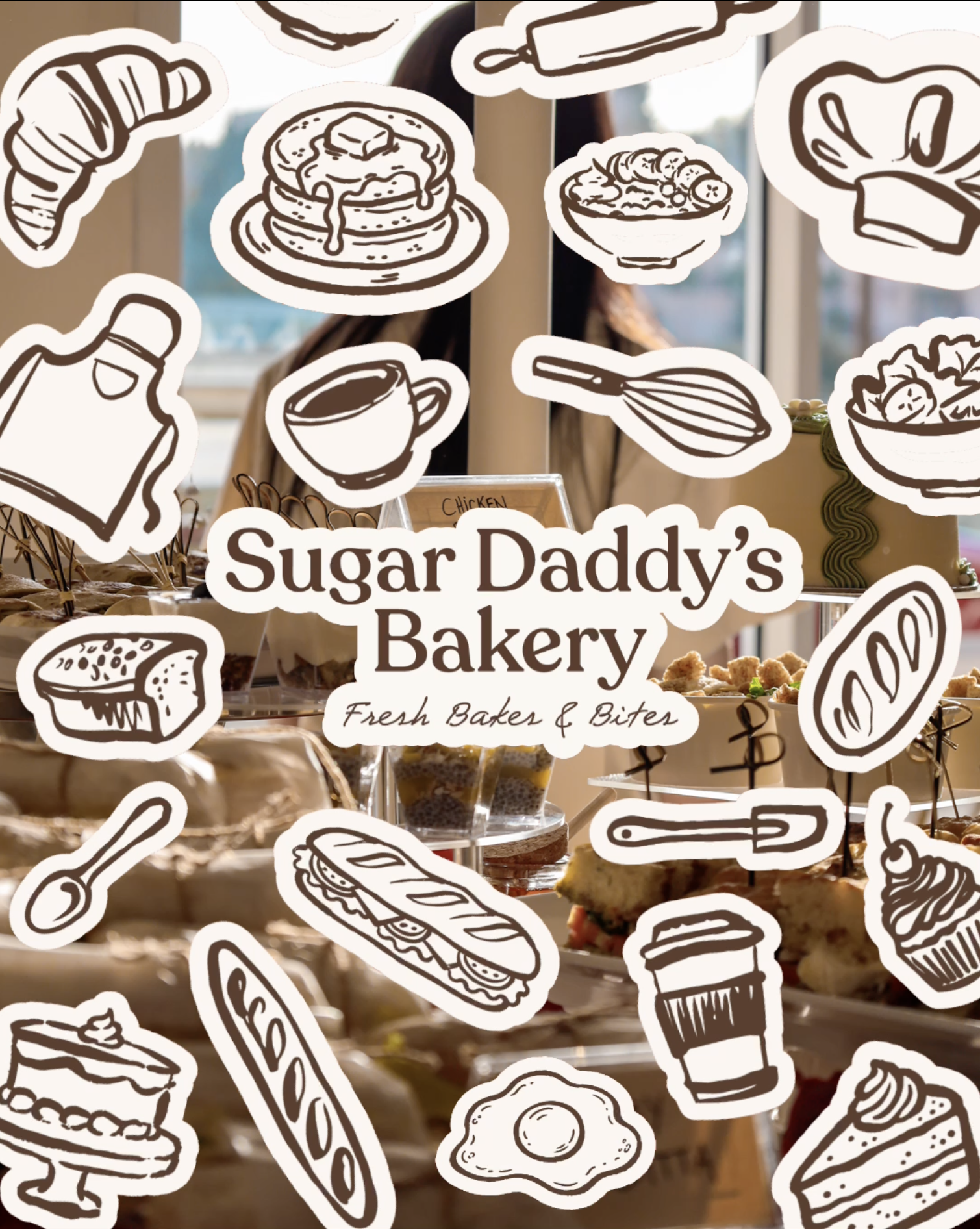
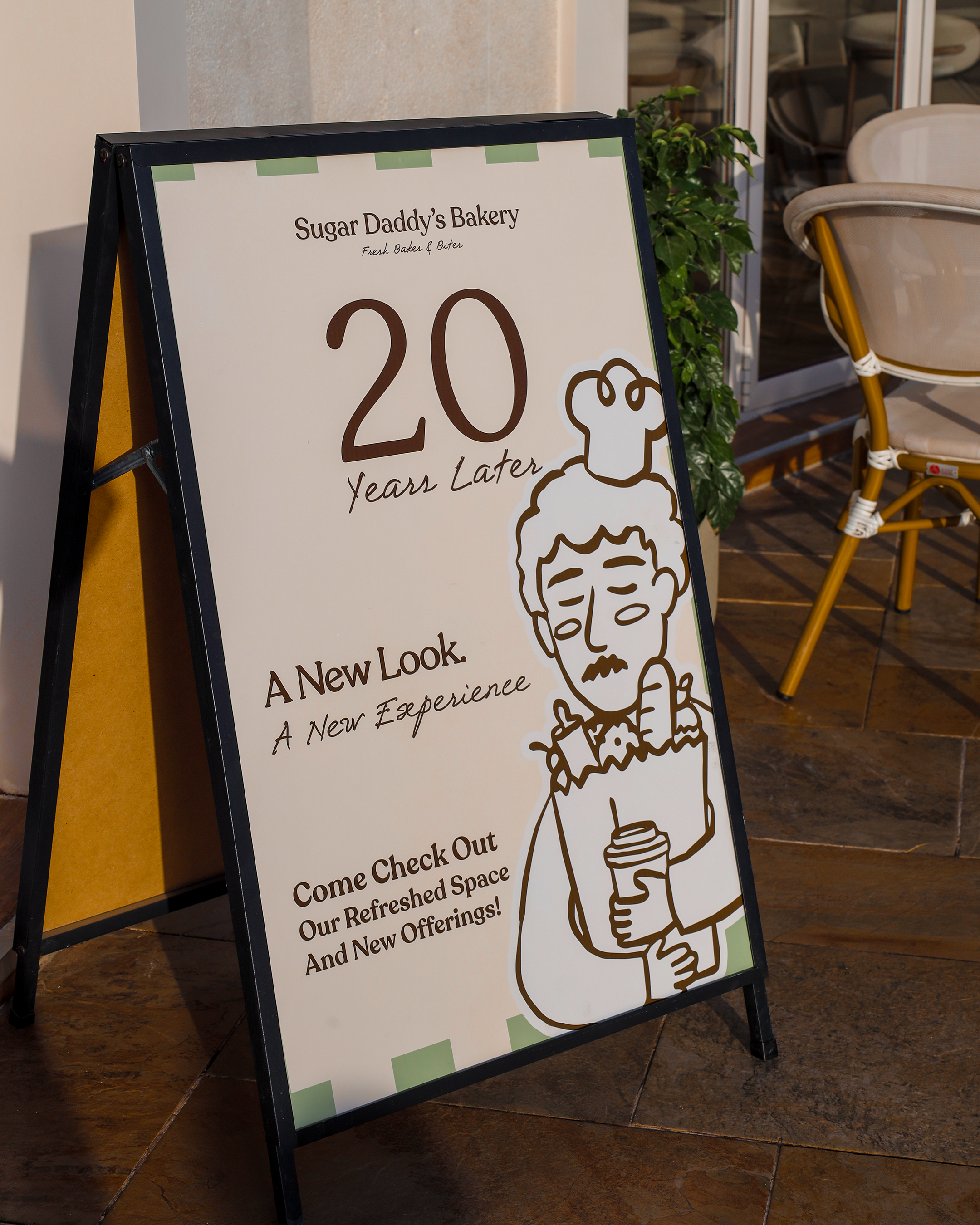
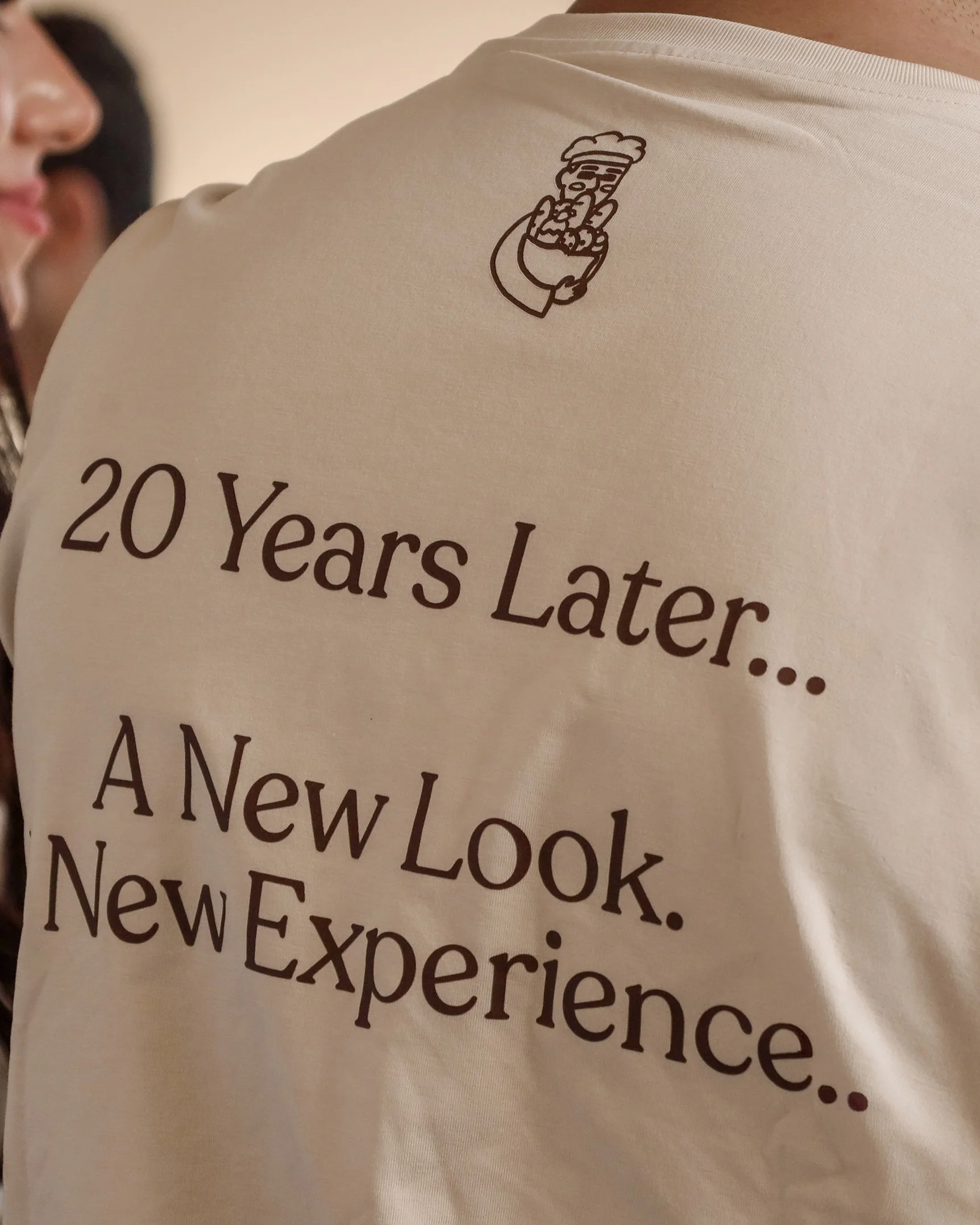
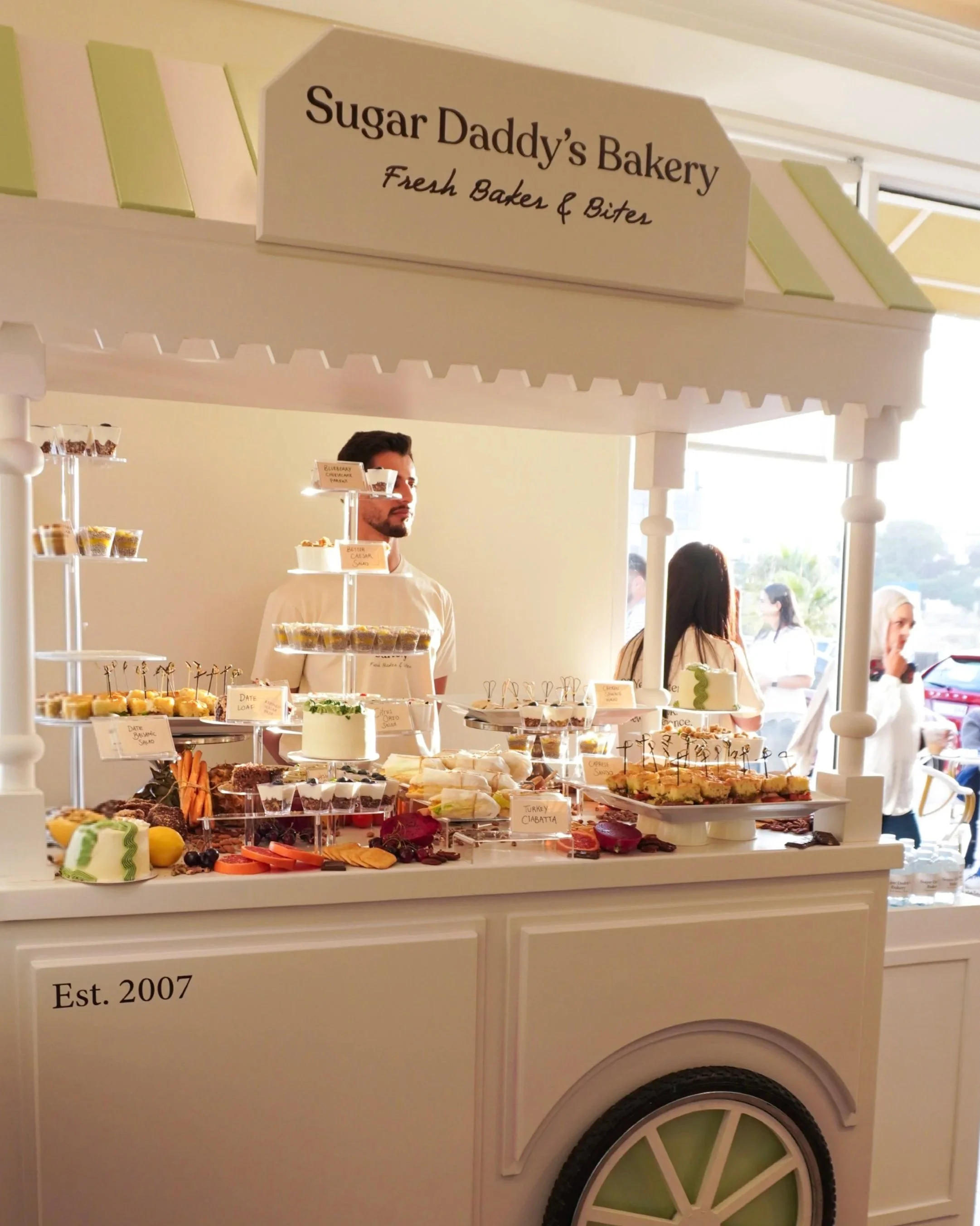
At the centre of the new identity is a distinctive chef mascot, slightly eccentric, full of character, and instantly recognisable. Designed as a recurring figure throughout the brand, the mascot introduces a sense of storytelling and familiarity, appearing naturally alongside supporting illustrations and graphic elements. This visual language extends across packaging, menus, uniforms, exterior signage, and environmental applications, allowing every touchpoint to feel connected while giving each its own personality.
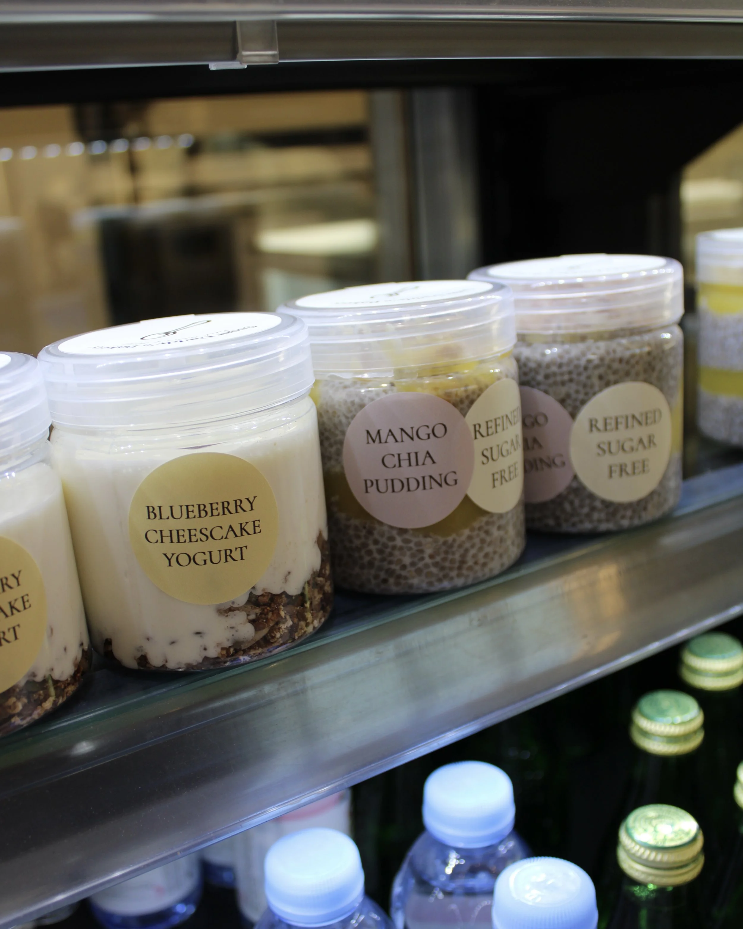
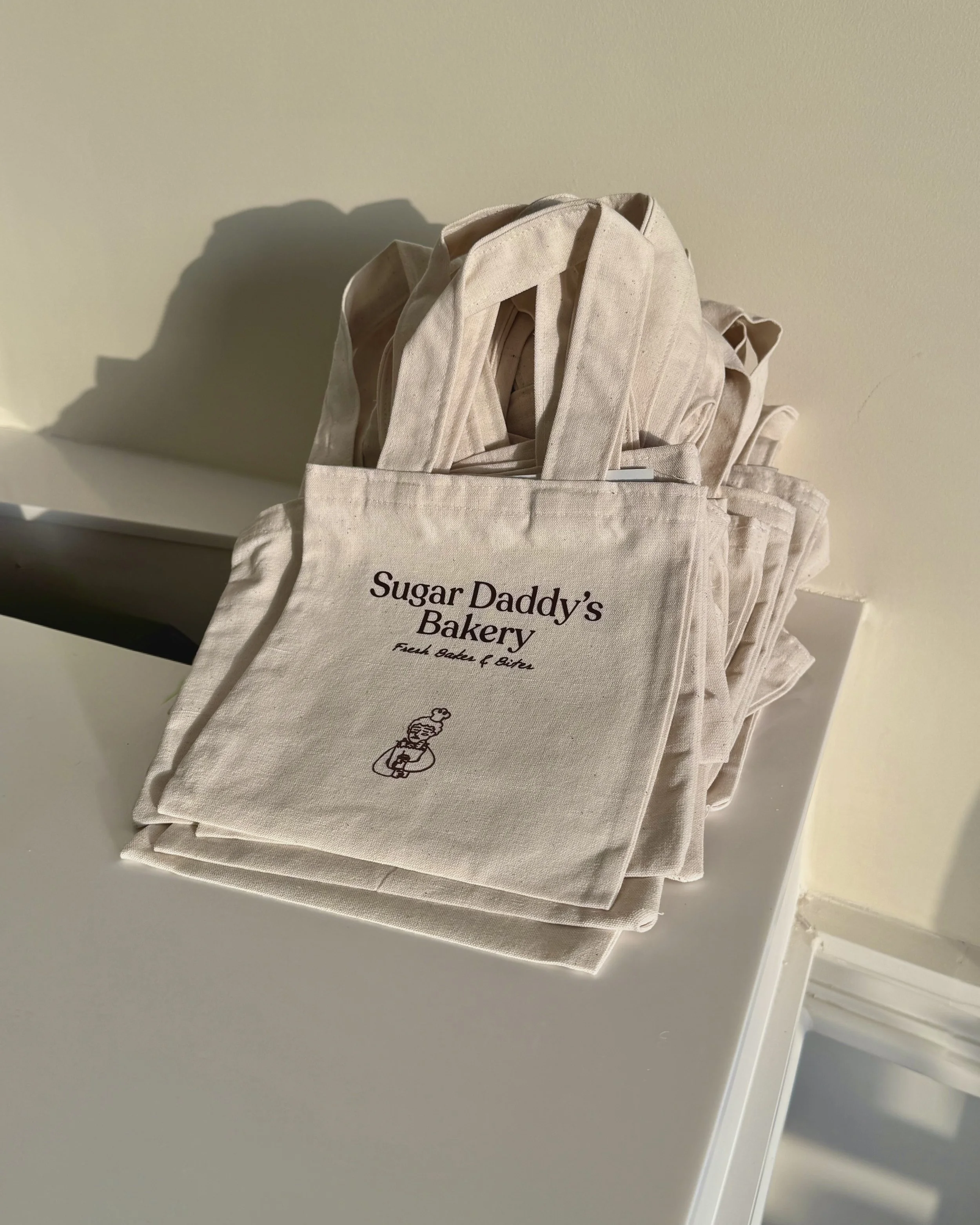
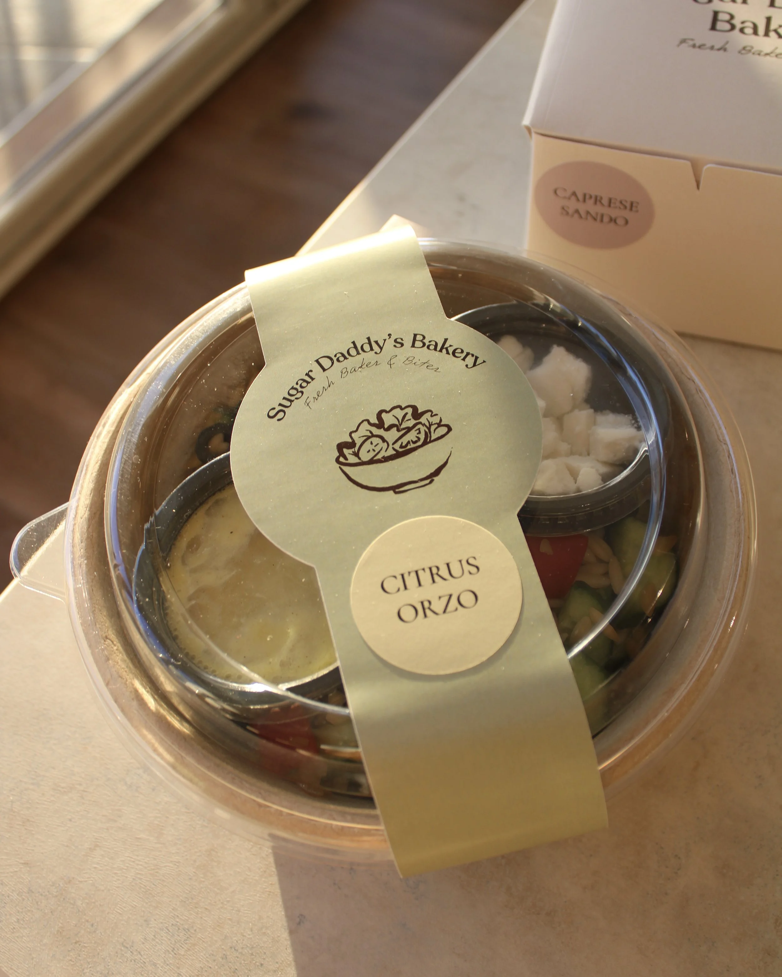
Beyond the visual identity, the rebrand was about creating a more cohesive experience, one that translates naturally from the storefront to the smallest packaging detail. Every element was considered to reflect the bakery’s artisanal direction while maintaining the approachable spirit that customers had come to know over the years. The result is a refreshed Sugar Daddy’s that feels more mature, expressive, and timeless. An identity that celebrates its history while making room for everything the bakery is becoming. It feels new, but never unfamiliar.
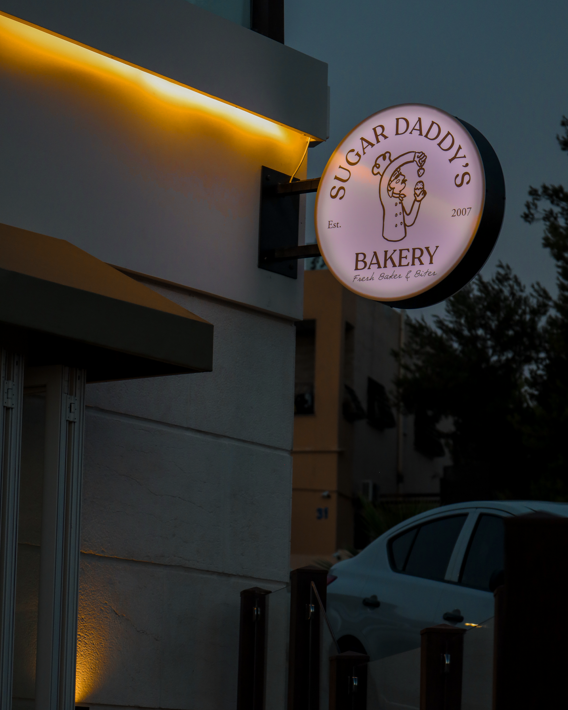
Amman, come by hungry.🍰🧁🥐🥖
