Branding Project: L’Entrecôte du Coin
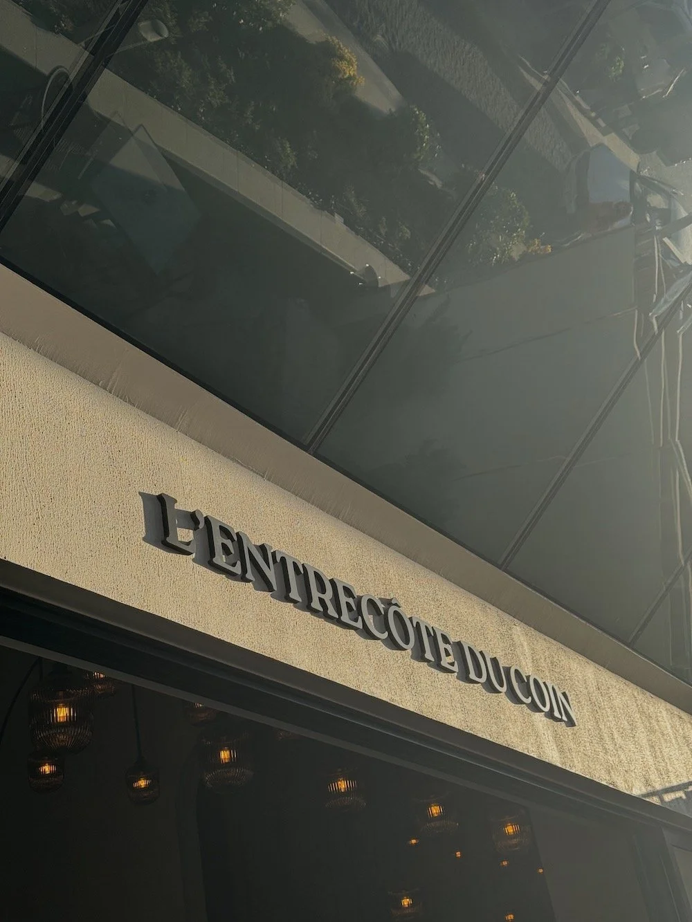
We took the elegance of French bistro culture and introduced just enough tension to make it contemporary. The use of Roca Bold sets the foundation: strong, clean, and confident, the perfect mix of modernity and authenticity. Paired with hand-drawn illustrations, the brand creates a visual language that feels both considered and distinctive - refined, but never rigid.


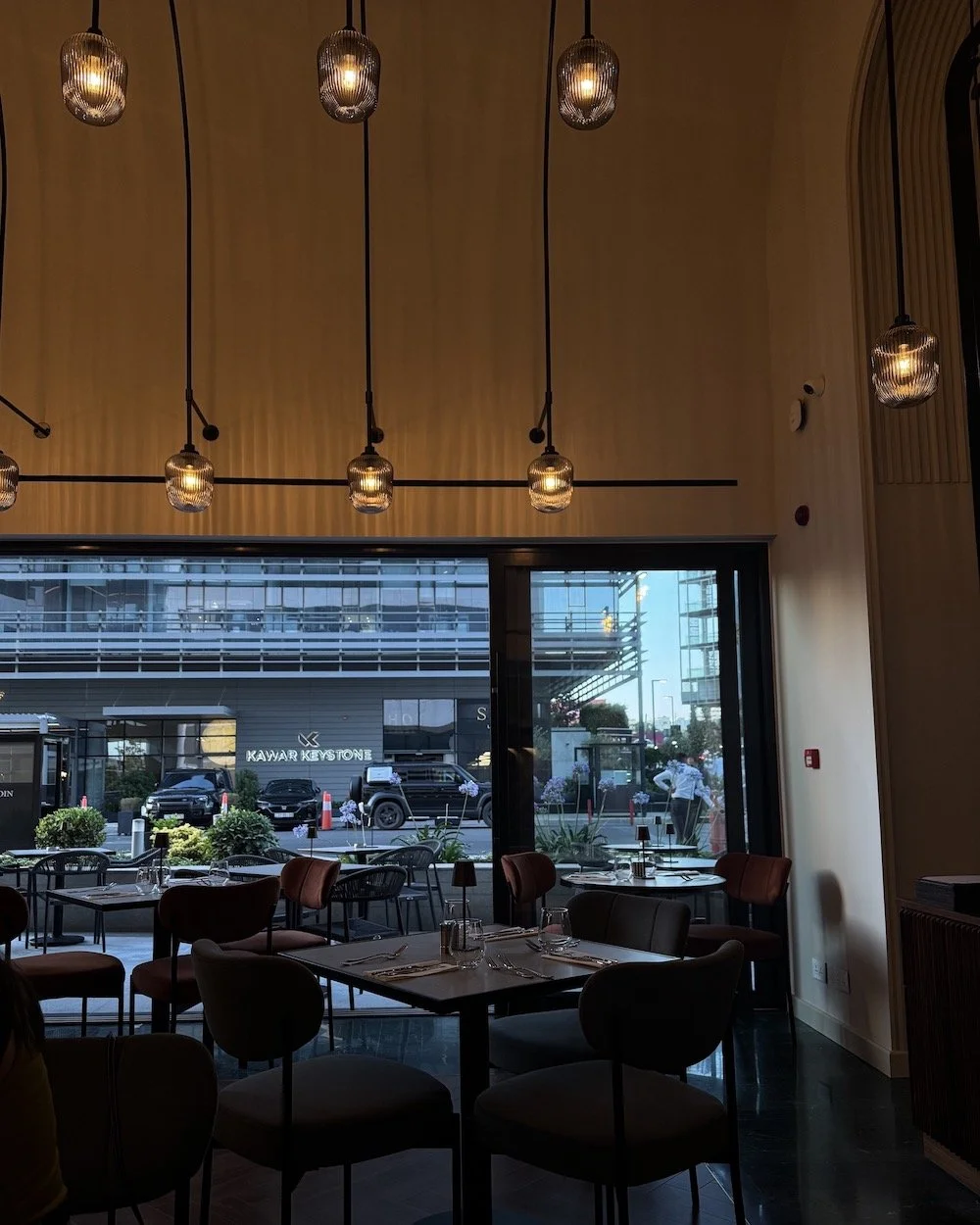
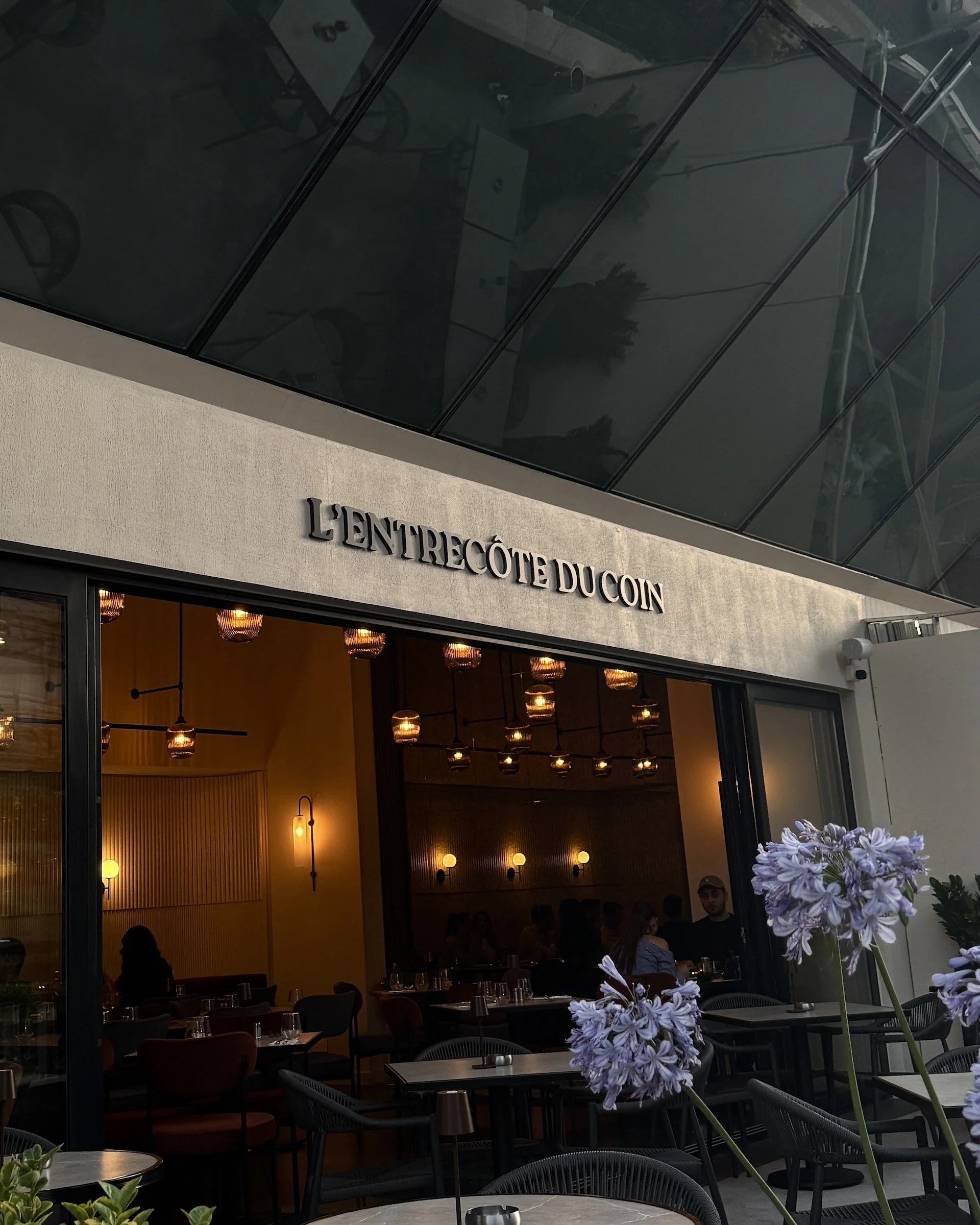
The color palette was designed to feel rich and balanced, muted tones sit alongside soft neutrals to create warmth, depth, and a sense of familiarity. Again, it reflects the brand’s core idea, blending contemporary design with a classic, grounded feel. This identity is about creating a dining experience that’s visually coherent, emotionally engaging, and built with clarity and intent.


Studio Mirage built the identity around contrast, elegant but relaxed, clean but full of personality.
From the playful illustrations to the bold type, everything works together to give the brand a clear point of view. It doesn’t try too hard, and that’s exactly the point.